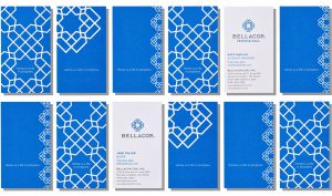
 “Home is a life in progress. It’s a place to be lived in and loved, and it’s always changing. Bellacor, an online marketplace for home furnishings and decor, aims to invite, inspire, and make it easy to find exactly what you’re looking for.
“WDW worked with Bellacor to refresh its brand identity. The logo we designed is made up of 8 individual Bs, whose interconnected areas form tiny house-shaped pieces and, also, hearts. We provided extensive guidance for Bellacor’s in-house team on various brand elements, including typography, photography, and voice, which they are currently rolling out on the company’s website and in its marketing efforts.”
Designed by Werner Design Werks


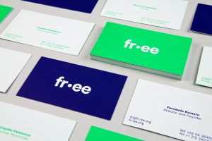 “FR-EE / Fernando Romero Enterprise is the global firm of the award-winning architect Fernando Romero. The studio is recognized for its pioneering design of projects such as the iconic Museo Soumaya in Mexico City, the forthcoming Museo Mazatlán in Sinaloa, Mexico, and the new Mexico City International Airport. Natasha Jen and her team designed a new identity and website for FR-EE that capture its innovative approach to architecture and design. The identity is designed to illuminate both the firm’s adaptability in translating historic, social, economic and environmental contexts and the underlying formality within their work. To achieve this, the designers set the logotype in lowercase Circular, which has fluid curvatures within geometry-based letterforms. Color is an expressive element of the FR-EE branding. The bold palette—a distinctive shade of fluorescent green, along with blue, purple and pink—suggest the vibrant culture of Mexico, where the firm is headquartered. The green also references the company’s commitment to green design and environmental sustainability. The responsive website showcases FR-EE’s wide-ranging body of work while capturing the firm’s energetic spirit. The entire portfolio is presented on the homepage as a universe of projects. These are imagined as illuminated objects with miniature, colored 3-D models. Once users begin exploring the navigation, the work can be filtered and reorganized by various factors. Each individual project page is a long scroll: high-resolution images, 360-degree rotating models, and videos allow users to experience each architectural work dynamically and holistically.”
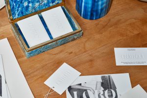
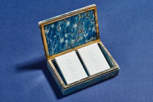
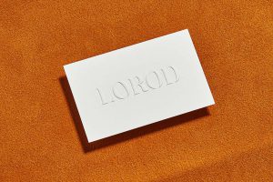 “Classic and contemporary meet in LOROD, a fashion brand by Lauren Rodriguez and Michael Freels that redefines timeless basics with modern, modular construction, distinctive fabrics and vintage-inspired chic. Pentagram’s Natasha Jen and team have designed a brand identity for LOROD that captures its unique mix of high and low, of refined craftsmanship and utilitarian functionality. The project encompasses the brand’s messaging and art direction of its fashion photography, as well as the design of the website.”
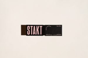 Branding, identity & art direction for Burger Bar STAKT Based in Perth, Australia
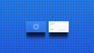 “PlanetaRunner is a web portal aimed to the world of running where you can find all range of information for professionals and amateurs: tips and advice, races and marathons, news and content related to nutrition, technology and fashion.
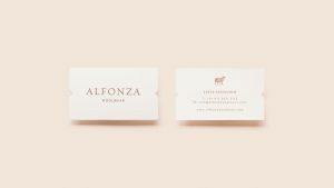 “In 2007, the entrepreneur Lucía Criscuolo founded Alfonza Woolwear inspired by the Calchaquí valleys where she grew up, in Tafí del Valle (Tucumán, Argentina).
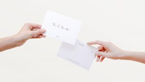
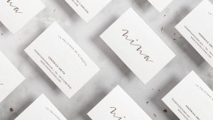
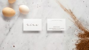 “We were contacted by Vero Smith to help her develop the visual identity and design the packaging for her new brand of healthy handmade tasty cookies, called Nina. We did a very delicate and crafty stationery and tried to reflect in our joyful designs for the packs the care and love put on every batch. Because in something as simple as a cookie you can find happiness.
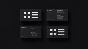
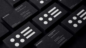 “4eAteliers is a CGI studio dedicated to create solutions and marketing strategies for real estate, and architecture projects. They are a multidisciplinary team of architects, cg-artists and designers, specialized in computer generated imagery, including renderings, animations, walk-throughs, real-time and virtual reality.
 “The Snob Hôtel was conceived as a bourgeois abode, created in essence, to pay homage to the Parisienne lady. This complex yet charming ideal of snobbery represents the Parisienne’s ’Eternal holidaymaker’ spirit as much as her ’chic and chilled’ demeanor.
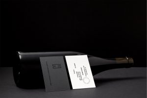 Brand name, logo and corporate identity design for the wine & deli concept store of ’Cava Halari’ chain. Every distiller separates the distillate to – head, heart, tale – focusing on the finest compound of its’ fraction, the heart. Reproducing the same values in the design process we created a corporate identity that engages you in the same experience of fractioning the paper in order to keep the substantive part where all the info are placed. In an effort to strengthen the brand even more we created thematic carte postale attributing the different meanings of the heart.