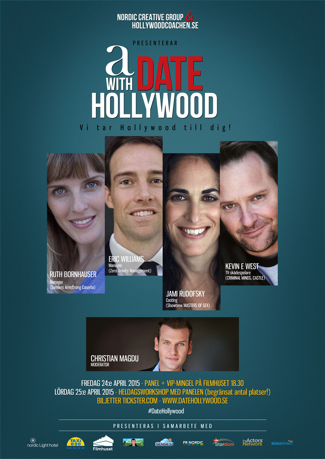
Vi på HollywoodCoachen är stolta medarrangörer till A Date with Hollywood – ett unikt, tvådagarsevent i Stockholm som går av stapeln 24 & 25 april 2015.
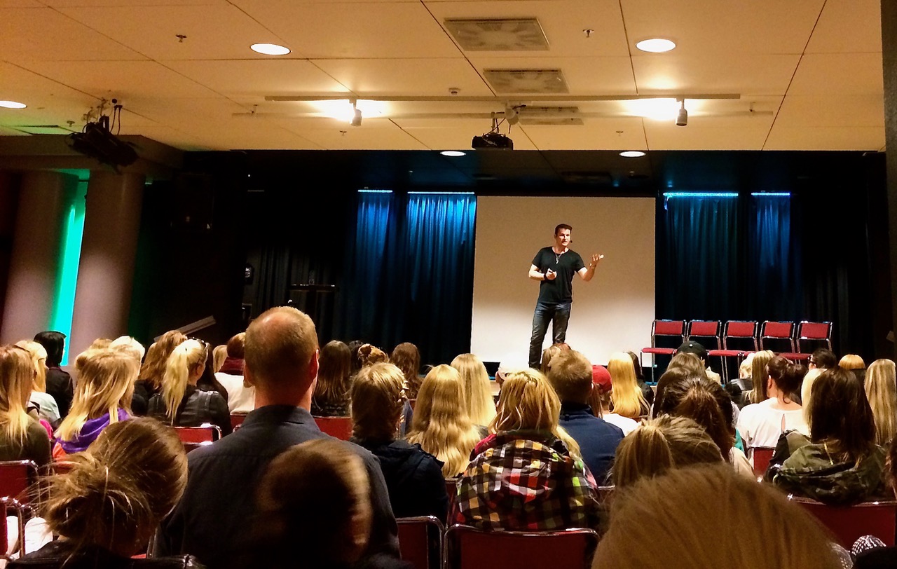
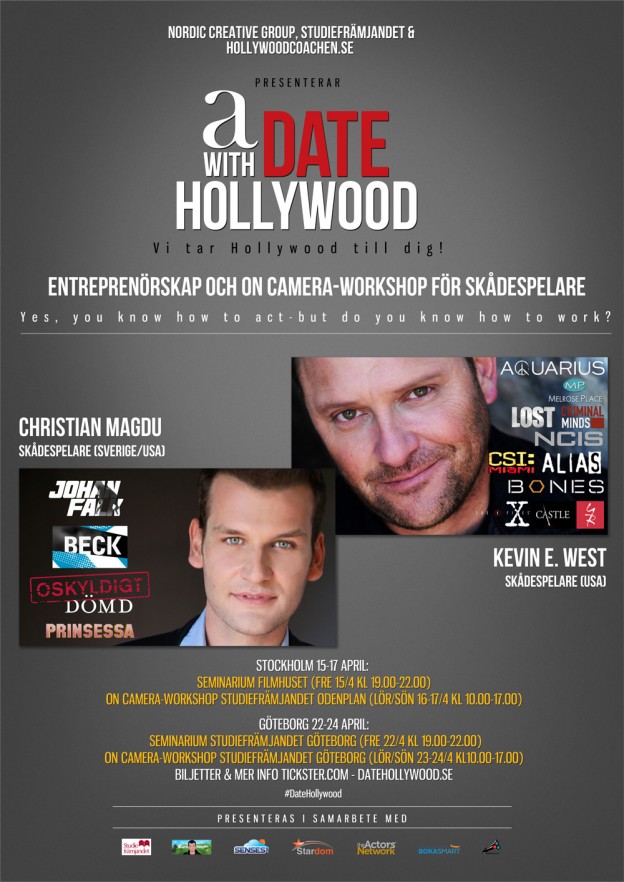
Det är skådismanagern Ruth Bornhauser (Sanders Armstrong Castera), rollsättaren Jami Rudofsky (Masters of sex), regi- och manus-managern Eric Williams (Zero Gravity Management) och skådespelaren Kevin E. West (Criminal Minds, Castle, CSI) som gästar Sverige för första gången för att inspirera och tipsa i hur man bäst ökar sina chanser att lyckas internationellt i världens roligaste och samtidigt tuffaste bransch. Under fredagen den 24:e april kommer panelen att framträda på Bio Victor i Filmhuset på Gärdet i Stockholm och dela med sig av sina erfarenheter och svara på frågor från publiken. Panelen efterföljes av VIP-mingel, där deltagare ur publiken får chansen att ”speed date:a” och presentera sig för panelmedlemmarna.
Lördagen den 25:e april är det heldagsworkshop, där maximalt 60 deltagare kommer att få fördjupa sig ytterligare med varje expert och få chansen till viss personlig feedback. Ämnena under dagen kommer att handla om allt ifrån hur man marknadsför sig på bästa sätt till hur man skriver och säljer TV- och filmmanus. Deltagarna kommer även att få uppleva hur en äkta Hollywood-audition på engelska går till och provspela inför en amerikansk rollsättare.
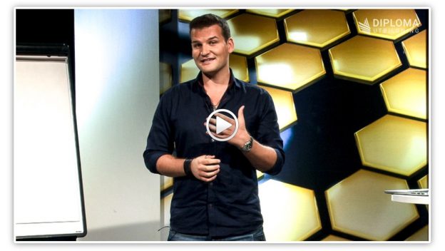
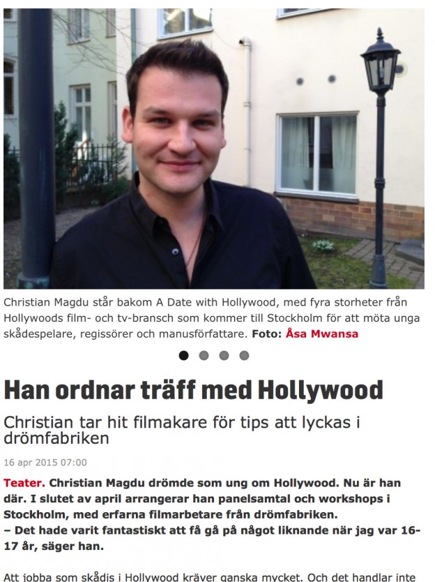
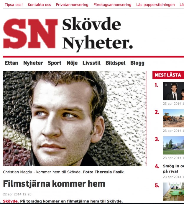
”Jag har märkt av ett stort intresse och nyfikenhet från svenska skådespelare och filmarbetare när det gäller Hollywood och hur man bäst kan öka sina chanser att få jobba internationellt. Därför känns det fantastiskt roligt att nu få välkomna denna efterlängtade Hollywood-panel och låta dem besvara frågor och inspirera oss alla live!”, säger Christian Magdu, skådespelare, som kommer att agera moderator under eventet.
För mer information besök: www.datehollywood.se